Thursday, May 16, 2013

Shaolin Bishop and the Bouncing Balls of Destiny

Shaolin Bishop and the Bouncing Balls of Destiny

My new video is finished (you can watch it here). This one was mostly about drawing, I didn´t do much computer stuff. I just drew the frames, scanned them, edited the pictures to the right size (1280x720) and played them. I was drawing chronologically, and I didn´t have a plan for timing. I think it´s visible in the video, because it may be a little bit slow. So, I will give more time to planning next time.

The video consists of 29 pictures and each one is shown for 0.06 seconds, which may be a strange number. It´s approximately 18 frames per second. I have tried different timing (12 fps and 24 fps) but this one looked most natural.

I´m not sure why, but when I tested the video by taking pictures of the raw frames (only pencil and all messy, no details) it looked better than now, when I inked it, and added the details. First think I do is drawing all the frames with a pencil (a very soft 6B, next time I plan to try 8B) and then inking it with a black pencil, to make it more visible after scanning. And I think that´s it, most of the description of what I did and how I did it is in the part I post.

Now I can go prepare the next Shaolin Bishop video where I will try another "tip to learn animation".

Tuesday, May 14, 2013

Shaolin Bishop and the Bouncing Balls of Destiny

After making a few animated videos (you can see them on my Youtube channel), I´ve decided it would be nice to do a few of those known tips that should help me learn animation a little. Some of these tips are on 11 second club, some are on Animator Island and I am sure there are hundreds of websites where you will find more. All these lists of things have common start: the bouncing ball. Bouncing ball is a great thing, I agree, the shape of a ball is simple and it´s easy to keep looking the same on all frames. But, I don´t know, bouncing ball seems a little boring to me, because I want to draw something interesting, not just circles.

I will do the bouncing ball, why not. But maybe if I add a little something, it´ll be more interesting to draw. Instead of one ball, there will be two balls. And also a cartoony character I would like to call Shaolin Bishop. It may sound like random madness. That´s because it is random madness.

The picture below shows the plan (it´s very rough, but just enough). The Bishop is in the middle and on the sides, there are poles (sticks, or anything you imagine) with balls on them. The bishop will jump. When he is in the air, he will kick his legs, hit the balls, the balls will fall and, finally, bounce. So, technically, it´s a bouncing ball excersise. In reality, it´s more.


I should plan the whole thing, like the timing and then draw exactly the right amount of frames, but I think I will try to be more relaxed about this video. I´ll just draw the frames one by one and see where it leads.

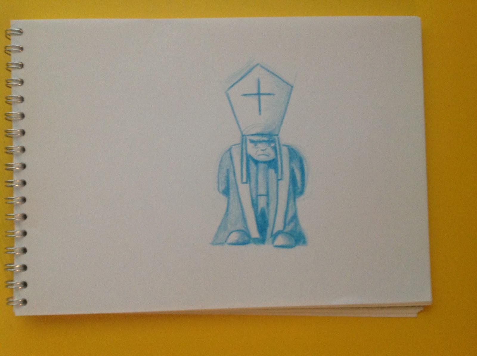
I quite like the idea of this character, the Bishop. Which is why I think I might stick to him for a little longer and use him in more videos. Firstly, his clothes are quite complicated, which makes the movement interesting. He can also have that funny staff bishops have, which means endless possibilities. Below is a slightly better sketch of what the Bishop might look like.  In blue colour, to add some diversity into this blog post.


Now to the technical stuff. First thing I did was drawing the whole thing into my small notebook (or sketchbook or whatever it´s called). On the picture below, you can see the first plan of what I wanted to draw. It starts with the bishop holding a staff, throwing it in the air, then he jumps and kicks the two balls and then the staff falls back to his hand. From what I´ve written above, it´s clear that I have decided not to do the staff bits, the beginning and the end. The reason is, that it would make it twice as hard and twice as long to draw, and this is a bouncing ball excersise. He can throw things in another video.


 After that, I have drawn 10 pictures of the bishop jumping to test if it looks ok (especially the hat, I was a little worried about the hat) and you can see the result below. I think it works fine, just the timing is (probably) wrong, it seems too slow. But, as I wrote above, I am not planning timing, so it´s not important now.


The final video and some more information about it will be in a next post.

Tuesday, May 7, 2013

Brody´s Ghost video - Final part


Here are the links for the other posts in the Brody´s Ghost video series:


Finally, everything´s done, drawn, scanned, processed and the video is finished. You can watch it here.

So, I suppose it´s time for a short summary of it all. It would be great to start by writing how long did it take me to make the video. But if I said something like 3 weeks, it would be misleading, because I worked on it only in my free time, not every day. Also, I don´t remember when I started.

But I can tell how many pictures I drew.
Head turn of the main ghost, Kagemura, is drawn on 11 pictures, for the zoom of Kagemura, I drew 1 picture (because I rendered it in computer), Chi has walked into the scene on 11 frames, the hand with snapping fingers took me 24 frames to draw, Kyo jumping into the screen was drawn on 18 frames, Soku on 7, Gi on 19 and Ran on 11. If you add these numbers, you get, that I drew 102 pictures of the Brody´s ghost characters. All of the 102 frames are together on a pictures below.


I should also mention the music and sound in the video. The music is quite simple, which is caused by the fact that I have made it myself in Garageband on iPad. And the sound of snapping fingers is a sound I recorded. That´s it really, no magic was involved.

And the absolutely last thing I will mention is this. As I have written in the Introduction (part 0) post, all the characters in the video are from comic book series Brody´s Ghost by Mark Crilley. I only drew them all in a different positions and on all the frames.

Monday, May 6, 2013

Brody´s Ghost video - part IV


Here are the links for the other posts in the Brody´s Ghost video series:


There are three more characters that will be entering the video at this point. And I plan to deal with all of them in this post.

First one is called Ran and my plan for him is to jump in the scene from above and turn during the falling. To make it a little more interesting. I mean make the drawing interesting, not necessarily the video.

Here is the picture of my plan, the part previous to the frame one will be rendered by computer as vertical fall with no change in shape. Just like before, for example with Kyo in part III.


This time, I have drawn the action on 10 frames, which turned out to look fine, so I think I´ll keep it that way.

The next character is called Chi and he is supposed to be known for his intelligence. Intelligent people don´t rush when it´s not necessary, so he will simply walk into the scene from the right side. I´ve read somewhere that normal walk is usually 2 steps per second, so I used that information and it worked. And it´s not exciting enough to be shown here I think.

The last character is a little more interesting. Its name is Gi and it looks like a ball. So I´ve decided it will arrive by jumping to the scene from behind one of the characters that are already there, bounce a little and then settle down. The picture below shows what I mean.


This one was fun to draw, I´ve started by drawing him as a ball, that bounces (I keep reading everywhere that bouncing ball is essential for people who start with animation, so here we go, I finally got to it). When I was satisfied with the movement of the ball, I added the parts that make this character look as it should.

Saturday, May 4, 2013

Brody´s Ghost video - part III

Here are the links for the other posts in the Brody´s Ghost video series:


It´s time to add some other characters into the video. The first one is called Soku and he is supposed to be quick. So I think it´s logical for him to arrive first and very fast. And that means not too many frames. The plan is for Soku to simply fall (jump into the scene) from above, as indicated on the picture below.


The samurai ghost Kagemura will not move at all in the rest of the video, so it´s enough to copy him to every frame as a foreground. In this case, I wanted the ghost Soku to arrive really quickly, which means I only drew 7 frames and his pose doesn´t change much during the fall (which is quite unrealistic, but the movement is too quick, nobody would notice anyway). There´s not so much to tell about this one, because it is quite a dull linear movement.

The second character was much more interesting. It´s a huge one called Kyo. Again, he will jump into the scene, but this time, it´ll be a little different. This character will end standing on all four limbs (just like a gorilla would). The fall will be a little more complicated. I think it might look natural and good, if Kyo is landing on the ground with his arms up (drags the arms behind in a way). So, the legs hit the ground first and then the arms follow and land a little later.


As you can see, the first picture I drew already has legs of Kyo on the screen. The previoous part (falling to the position of the first frame above) will be rendered on computer, because I didn´t want to waste paper on that.

I´ve drawn 17 frames (the top one on picture above being frame number one, the bottom one was number 17), only to find out, that the timing was wrong. If I play all the 17 frames, the fall is too slow. It doesn´t work because this character is supposed to be heavy (well, he´s still a ghost, but he should act as if he was heavy, it looks more natural). The fall that is too slow is on the video below. It´s the 17 frames played at 25 frames per second speed (every drawing is shown for 0.04 seconds, except for the last one).


It´s quite easy to solve such a problem. I just won´t use all the frames I´ve drawn (which is a shame, but it needs to be done). So, I´ve eliminated six of them and you can see the result of the same scene done only in 11 frames below. The frame speed is the same.


Friday, May 3, 2013

Brody´s Ghost video - part II

Here are the links for the other posts in this Brody´s Ghost video series:


Second part of my new video is going to be zooming out from the ghost Kagemura and then him rasing left hand, snapping fingers and putting his hand down again. I´ve decided not to get distracted by things like whether a ghost can snap his fingers, lets just assume he can.

The zooming part was quite a hard one. The problem is this. As you can see in the "part I" blog post on the pictures, I was drawing the character big (close to us). Which means I don´t have him drawn full, just the part above waist. Which means I can´t simply take this picture and make it smaller and smaller (rendering the frames on computer). I need a new drawing of Kagemura. The start and final picture of this zoom scene is on the picture below.


There are two ways of doing this. I can either draw the full character (as on the "end picture") in the size of the "start picture" and then make it smaller and smaller until he gets to the size of the "end picture". This is the good way, drawing something big and then showing it small can´t hurt.

Second way is, to use the "end picture", zoom in to make it look like the "start picture" and then render the frames while it´s getting to its original size. This is the bad way, because if you have a picture and zoom in, it looks terrible.

But I have decided for the second (worse) way in the end. The reason is, that the first would be much more complicated. I draw all the frames on A4 papers horizontally and I know how to edit the frame after scanning it to make everything work together. But if I wanted to draw the ghost in the "start picture" size, I would have to make it on vertical A4 paper and that would bring a lot of confusion with scaling.

After some experiments, I´ve decided the zoom to take 2 seconds, which means I have rendered 48 frames in the computer for it.

The next part is the snapping fingers. In this part, only the left hand of Kagemura will be moving. And because I am lazy, I´ve decided to draw only the hand and add the body later to every frame. I have drawn 24 frames of the hand, which could seem like a 1 second of video, but it´s a slow movement, so I´ll play most of the frames twice and some will be shown even longer (for example the frame just before the fingers snap and the one just after). The video below shows what I mean (it´s not a final version, the timing there still looks a little weird to me). 


Tuesday, April 30, 2013

Brody´s Ghost video - part I

Here are the links for the other posts in this Brody´s Ghost video series:


In the last post, I have written about my plans for a new video. The first part is the ghost Kagemura arriving to the center of the screen and turning his head to the camera.

I have started with the part where he turns his head, because that is the harder one. It involves changes of shapes which means I need to draw all frames by hand. The action of turning head is a slow one so I think it´s not necessary to aim for 24 frames per second. 12 frames, where each will be played twice could do the trick.

I started by drawing the first pose (profile) and then 11 more, each time turning his head slightly. The goal (the first picture and last picture) is shown below.


I should also point out for those people who have read Brody´s Ghost comics or seen this character somewhere, that my version is not 100% accurate and I don´t even want it to be. I´ve simplified some parts, because the characters must look the same (or at least very similar) in each frame and that´s hard enough even without all the proper details flying everywhere.

To the method of drawing I use is very primitive and I have mentioned it a little in one of my previous posts. It´s necessary to make the blank transparent paper (new frame) be exactly on top of the previous frame and make it not move. My solution for this is on the picture below and it works just fine.
 Another quite important fact is, that the A4 paper has a wrong size. The Youtube format is 16:9 and A4 is different. Which is why I also have a blank white paper with a 25 cm x 14 cm big rectangle in the middle, which approximately represents the frame. And I put this paper under the transparent papers so it´s visible. It would be a solution to draw or print this rectangle on each transparent paper. But I don´t like to waste my time doing things I don´t need, it´s easier to use one of the features of transparent paper - transparency.


Below is the picture of all 12 pictures/frames I have drawn for this particular scene (part I) of the video. Just to show that I am not cheating if anybody suspected me.


And the result can be seen in a video below. I played every frame twice, plus the first one and last one. These are shown for a little longer. By every frame twice, I mean every frame is shown for 0.08 second. Which means that technically, I am drawing at 24 frames per second, but I play the frames at 25 frames per second. And when I am playing every frame twice, it means I am playing them in a spee 12.5 fps. Which doesn´t really matter and it makes no change, I only wanted to mention it.


So, that would be for turning the head.
At the arriving to the screen part, I only took the first frame (profile one), deleted the background (which I described here on another example) and then I made program called Synfig render the frames by moving Kagemura a few pixels each time. Which is 109 frames - 4.5 seconds.

Friday, April 26, 2013

Brody´s ghost video

In the last post, I was writing about my rain video, which was quite a technical thing to do, drawing wasn´t involved so much. And I think it´ll be nice to draw a little more this time. I´m too lazy to create a proper character of my own for the new video. Problem is that (obviously) in my few-second-long videos, I can´t develop epic stories. So I´ve decided to do a short video with characters of someone else.

I like videos of Mark Crilley on Youtube, mostly about drawing manga, or drawing in general. And I have bought some of his comic books, called Brody´s Ghost, which I like. So, I´ve decided to try make a short animated video with some characters from Brody´s Ghost. These days, I read everywhere about copyright and some punishments and courts and laws and people going to prison, which makes me slightly nervous about this whole thing. By doing short animated video with characters from Brody´s Ghost, I will probably break copyright laws, Geneva Conventions and Prime Directive from Star Trek. But I think I´ll risk it anyway.

And now to the video itself. In the Brody´s Ghost comic books, there is a samurai ghost called Kagemura, who has five companions, other ghosts. My idea is, that the samurai ghost will be floating from the left to the middle of the screen, where he will stop. Then he will turn his head and look into the camera. The camera will zoom out a little and he will snap his fingers to call the other five ghosts who will jump and arrive to the scene. In a fight preparation kind of way.

They will arrive one by one, because I don´t want it to be chaotic and I want the video to be longer. That´s it. I think I will spend less time cleaning the whole thing in computer, because that´s not the point here. And it doesn´t help much either. Which means there will be no colours or black and white or anything like that.

I like to start in the beginning, which is the reason why I am starting with drawing the samurai ghost turning his head to look at us. This is the first thing, desite the fact that he has to arrive from the left first. I have decided that arriving from the left is not an exciting action movement so it´ll be good enough to make my laptop render the frames. I it is enough to take the character and move him from left to the center, there will be no change of shapes. And when there is no change of shapes, I don´t see a reason to draw it. That´s boring.

On the video below is my usual ugly (or maybe I should call it rough) first try of seeing what I want to do and deciding about the timing. It´s a series of a few main drawings that tell what is happening. The drawings in between, that I´ll add later, will be there just to "do the movement" and help getting from A to B.


And here are the links for the following posts for this video:

Wednesday, April 17, 2013

A Rain Video

After an unusually short amount of time, I´ve put a new video out there. As promised in the last post, it´s just a rain test with a few things moving.

This time, I didn´t draw much, I only drew the background city, which consists of 8 layers. This may sound like a lot, but in fact, I drew two pictures and made the layers in computer. On the picture below are the layers as I made them. Number 1 is the top layer, layer 2 is below that, etc. and layer 8 is at the bottom, so the most of it is behind something. I originally wanted more moving things in the video, but then decided not to do them all. That´s the reason why I have divided the background into more layers than necessary. The green colour indicates the parts of the picture that are deleted, 100% transparent. The layer one only consists of the bridge, for example.


The next thing I did was insert a few images in between certain two layer. Like an image of a train in between layer 1 and layer 2, did some settings in Synfig, the rain above layer 1 etc. Then I blurred everything. Because it looks much better when everything (including the rain) is a little blurry.

The blinking signs (like the "casino" sign on the building in the middle) were very easy. I have done that by switching between two frames. One is empty, fully transparent, and the other one has only the sign "casino" in black colour at the right position. By switching between these two, it (hopefully) looks like blinking sign.

In the end, I let the Synfig program render all the frames. This little short video of mine consists of 614 pictures. Which would be insane to do manually. Insane and unnecessary. So, there you go, this video was done mainly on computer, which is the reason why is every movement linear and not very interesting.


Saturday, April 13, 2013

The Rain Experiment

My last video is finished and it would be nice to start doing something new. Because I am not full of ideas this time, I´ve decided to do a rain test. Which is an attempt to create an animated rain. I´ll do some background city and there will be probably moving objects (apart from the rain, the rain itself will be moving of course). But nothing complicated. Because it´s about the rain.

It´s obvious that doing all individual drops of water and making them fall down is a stupid idea. It should be enough to make loads of short lines on a paper (all in the same direction) and then move the camera up on the paper. That could do the trick.

As always, I wouldn´t write about it if I didn´t have something done. Below is a picture of what I have drawn, if the word "drawn" can be used here, it´s just lines and I used a ruler, so it probably won´t be shown in Louvre any time soon.


I think if you look at the picture and all the lines and try to imagine them moving, it looks a little like rain. Next thing I´ve done was cutting the frames out of this. A frame is 16:9 size and the picture above is vertical, approximately 3 frames high. But I didn´t just cut it into three parts, that wouldn´t (probably) look good. I have started on the bottom end and made one frame. The next frame was 50 pixels above. The next one was 50 pixelse above, etc. This gave me 24 frames (one second of video, that´s a nice coincidence). But when I played it at 24 frames per second, the rain seemed too slow and not random enough. So I played all the odd-numbered frames first, then the even-numbered and then cycle it. And the result is below. Not bad, I think.


It´s very light, I don´t know if there is anything visible by the human eye on the picture and the video. But I hope there is. And I think I should get back to work on that city background.

Monday, April 8, 2013

New Video

I have finally finished my last video. You can watch it here.
The process of making this new one started here. So, I´ve decided to write some statistics about it in case someone was interested.

The video has 8.64 seconds in total. The final version on Youtube is longer because I added the intro and the end titles (neither of which was really necessary, I suppose :D ). Anyway, 8.64 seconds. It took me about three weeks of not really intensive work and (this is not a surprise) the most boring part was the cleaning, colouring  and similar stuff on computer. I enjoy the drawing, these technical things are not so interesting for me.

Back to the statistics. The whole thing is on 25 frames per second, because of Windows movie maker that I use to transform the images into a video. You have to decide about the time for which each frame will be shown, not how many will there be in a second. And 1/24 is not a nice number. But 1/25=0.04 is, therefore 25 fps. Some parts of the video (short ones) have the flying bird frames shown on 12.5 fps, half the usual. These are parts where the action is slow (for example when the bird is gliding from left to right). I think it still looks good enough, even though there are not enough frames.

I have drawn 110 images of the bird in different stages, scanned it to computer, deleted the white backgrounds, and coloured the bird (really annoying). Then three pictures of the buildings (which can also be called three layers of background, I suppose). You can see them here or, obviously, in the video. I drew and inked these by hand and then coloured them in a computer. For the lowest layer of background, I have used watercolours and tempera colours. I wrote about these backgrounds in a previous post.

If you are into finance stuff, the transparent paper (only for drawing the bird) I used here cost me approximately 6.6 EUR = 8.6 USD = 5.6 GBP, pick your favourite currency. It was all drawn on an A4 size paper, with a 16:9 rectangle (the screen).

That´s all I had to write today, thanks for watching the video (if you did) and thanks for reading this post (if you did).

Thursday, April 4, 2013

Backgrounds Again

In my last post, I was writing about the buildings in the background. The idea here is, that there is blank space between the buildings. And obviously, there needs to be something like a distant background to fill the gap.

The first idea I had was quite obvious. There should be the rest of the city in the distant background. Then I thought about it. It would be quite hard to paint, and it wouldn´t make much sense. It would create an impression that there are the buildings passing by, then there is some strange large gap and then there is a distant rest of the city.

The second idea I had was a forest. It doesn´t make much sense either, but maybe it could have been some kind of park in the city. And there would be a contrast city vs. forest, which I liked. And I painted the forest background.


I´ve never painted a forest before, so I just followed the instructions from a video by Mark Crilley. My forest doesn´t look perfect on this picture, but it would definitely be enough for a background in a short video. The problem is, it doesn´t look good when used as a background for the animation I have, so I won´t use this one.

The last idea was to make it just open sky. It´s not original, exciting, shocking or funny, just a sky. So I painted a sky. I´ve tried it with the animation I have so far (the buildings with the bird) and it looks ok, so I guess I´ll use this.


And, surprisingly, I think it looks better as a picture alone than the forest did. And it took about half the time of painting the forest. I guess sometimes it takes time to get what you want. And I think that´s enough for today.

Wednesday, April 3, 2013

Background

As I´ve written in my last post, I am trying to do some passing background buildings. This update is only here to show how these will look. If you click on the pictures, you´ll see them in a more finished state.


I think there  is no need to add more detail, because it will be moving. Nobody will notice if the windows are not perfectly shaped or something like that. At least I hope nobody will.

I´m also thinking of adding colours, because like this, it might be a little confusing when the three pictures are combined into one. I have also drawn a few frames of the bird, because the flying sequence was too short.

Now, I can make some risky estimations based on the stuff I have processed in the computer to a more final stage. I think the final video will have around 8 seconds. That sounds very short, but just to put it in context, in the beginning, I was planning for 3 seconds, so there will be almost 200% more stuff :D. And I think it should be finished in a week.

Tuesday, April 2, 2013

Moving Background

As I wrote last time, in my new video, I will need flying through a city. That involves some buildings movement, unfortunately. I´ve never done this before, but my idea how to do it is quite simple. I´ll just have two buildings on the sides and nothing in middle. And I will make this picture bigger and bigger, so that the buildings will appear closer and closer and they disappear eventually.

I did a little test to see how it might work.


I think it looks good enough. I´ll daw better buildings (obviously it won´t be just boxes with lines). Then it might look really good. I think.

I´ve also had some progress with drawing the animated bird. I´ve drawn 60 frames (which is a big number by my standards), that you can see below. Again, not bad at all, I think I´ll keep it that way.


Now, I´d like to draw the background buildings (and see if my idea works), then clean the 60 frames of the bird, so that I can combine it with the background (in a way I wrote about earlier) and finally the background that will be visible in between the passing buildings. Still a long way to go.


Saturday, March 30, 2013

Let´s try again

My second video is done and finished and out there. So it´s time to start with another one. I think this time I might do something shorter, much simpler, but more detailed (better drawn). My first idea was a person playing a piano, but that didn´t interest me so much so I decided for something that might be a little more challenging and involves some background action (not much, just some).

The idea is a flying bird. The "camera" will be a little behind the bird, following it as it flies through a city. Could be good, if I manage to draw it properly.

I have started by watching a few videos of flying birds on YouTube (which I normally don´t do because I don´t care about birds much) to see how the bloody animals move. And after that, I´ve quickly drawn a few pictures to see if it works and to decide about the timing. The result is below.


Yes, it´s ugly and barely visible, but that was the point really. Not to spend too much time on this, it´s just a part of planning. From my last video, I have some experience with results of bad planning. And I want to avoid it this time. I think it doesn´t look bad as it is, it´s on 5 frames per second speed, which means that if I take the pictures (draw them better of course) and then put 3 frames between each two, it might work. I´ll probably make the flight longer later, but for now, this is enough to start with.

I have also heard, that if you draw frames continuously one after one, the action is smoother than if you do a few key drawings and then put another drawings in between them. So I think I´ll try that, I have nothing to lose.

Anyway, not a bad start, I´ll see if it works.

Tuesday, March 26, 2013

#9 The New Video

This will be a shorter one. I have finally uploaded the new video. And you can watch it here. Come on, you know you want to.

I am not so completely happy it, I think I may have aimed too high with this. It was a little complicated (as you can see in previous posts) and I it doesn´t look as smooth as I would want. But, there are some bits of the video I really like. After all, this is my second video, and I think there is quite a big progress from the last one. And I enjoyed all the drawing, and that´s the point.

So, that would be enough for this post, I have already starting drawing the next video, and it´ll be simpler, and hopefully more realistic. And maybe even better than this one, we´ll see.

#8 Combining pictures

Imagine you have two pictures and want to make them into one proper picture. You have drawn two layers of one picture using pencil, got both to computer and now you need to put the layers on top of each other so that it all works as intended. On the picture below is an example of what I mean, I have a picture of a hand holding a pencil (top layer) and a drawn knight (bottom layer) and I want the image that combines both.

It took me some googling and experimenting to find out that what I need is to let the picture with the knight as it is and cut the hand from the first picture. But! Cutting the hand by hand (ha, humour) would be madness. 

There is a nice tool in Gimp software, that can automatically select foreground, which is apparently what I want. If I understood the stuff I found by random googling well, it works by recognizing colours (or something like that) and separating the background from the foreground based on the colours (or something like that). On my picture (that you can see above) colours are not really involved, there is just line and the rest. Which can be easily fixed by colouring the parts of the picture I want to delete with some absurd colour. Like green.

   
And then just use the foreground select tool, which is described here. This selects the hand. Then all I did was inverse the selection (Ctrl+I) and delete everything selected (Ctrl+X). It all worked surprisingly well and quickly, but it took me a while to find out what do I want and how do I do it. So maybe someone finds this helpful.

After deleting the unnecessary bits, you can just put this picture with a hand on any other picture. And make it work as one picture.


Sunday, March 17, 2013

#7 Size Matters

This time, I´d like to write about something quite important, and that´s size of the frames and size of the "screen" (you know, that window on YouTube). Because it´s something I didn´t think about much and now I have problems with it.

When I started drawing the frames for my next video (all frames are drawn by the way, now I am scanning it to computer, cleaning it in gimp, and maybe in future, adding some colours and nice backgrounds if I care enough to paint them). That´s a sentence with a very long interruption in the middle, let me start again. I drew all the frames on transparent papers of size A5. And for YouTube, your video should be in 16:9 format (they recommend 1280x720 pixels).

After drawing all the frames and scanning a few, I have realized, that A5 size paper is not, in fact, 16:9. Without bothering anybody with details, the 16:9 format is wide and A5 paper is not wide. Below is a picture showing how a 16:9 frame looks like (the red line) and how one of my A5 frames look like.

It´s not very clear to me how to solve this. Stretching all my frames to get them wider is a ridiculous thought, because it would deform all the shapes, so that´s not a way. Making the frames larger (in computer) and then cutting a top strip and bottom strip is not a solution either, because the part of the frame I would have to delete would be too big. Leaving a white strip on each side of every frame (just like in the picture above) might work. Unless you have some action happening in the left or the right edge of the frame. Like I do. See below.

As I see it, there is only one way. I have tried to avoid it but I can´t. Leaving the frames as they are and having those ugly black strips on the left and right side. It´ll look like a French film from the 60s that doesn´t fit any modern screen, but I think I might get away with it if I call it vintage style video. From now, I am doing a vintage style video.

P.S. the frames on the pictures in this post are yellow. The only reason for that is to create contrast so that it´s clear that the frame is smaller than screen. The real frames are not yellow and it will not be yellow in the final video. Just explaining if anybody cared.

Tuesday, March 12, 2013

#6 Problems With Breathing

This time, I have decided to get the scene where the knight is just standing and breathing to a finished state. It was much worse than I expected.
During the inking process, I didn´t pay as much attention as I should have. That resulted in a terrible video, where the helmet of the knight changed shape all the time and it was incredibly messy. In this post, I´ll write about my three attempts to correct it.

Attempt 1


Now, what to do with a video where solid things change shape. I have redrawn all the frames again. It´s only 8 frames, not pleasant, but no big deal. And the result was better, but not much. The helmet needed to be the same shape the whole time, and it wasn´t.

Attempt 2


I´ve decided, that when you breath, your head doesn´t move at all (which is a lie). So I took the first frame, I have deleted everything except the head and copied it to all the other frames. Perfect, right? Now the head doesn´t change shape. Watch the video below to see the result of that.


Terrible, it looks ridiculous. He is not moving his head at all. It looks unnatural. Also, his left shoulder moves weirdly (actually, it changes shape in an unnatural way). I was quite happy about the rest. It wasn´t perfect but, I think it was good enough.

Attempt 3

My last attempt. I have decided to copy the head from first frame, just like in No. 2, but this time, I would move it slightly in every frame in the direction of the shoulders. Which means up and left. 


As you can see for yourself, still no perfection. But I think I´ll leave it like that. It is an improvement from the previous versions, and I don´t want to spend too much time on a short unimportant scene like that, which doesn´t help the story at all.

Now, Iď like to concentrate on making the scene where the knight hits the pencil (for the first time) with his shield. So, that should be topic of the next post.


Saturday, March 9, 2013

#5 Some More Scenes

As promised last time, this blog post will contain some more finished scenes (finished in the vaguest possible meaning).

Scene One 

I thought it might be nice to have a scene where the knight doesn´t do anything, just waits for the next move of the artist. However, if the knight stood still, it would be like essence of boredom, he should move a little. And one of the obvious things people tend to do even when they are not doing anything is breathing. In this case, I thought the knight might be tired from all the jumping around on the paper so he might be breathing heavily. Watch the video below to see what I mean.


I have only drawn it once, of course, I just looped it four times for the blog, the timing needs some work, the breathing looks too quick to me like this. I am not sure where in the video this scene should be used, but maybe when the artist is looking for some weapons in his drawer, it might be nice to just show the knight breathing heavily. 

Scene Two

The next one is a piece where the knight hits the pencil with his shield and makes the artist drop it. Not so much to say this time, the video is below. Unlike the first video in this blog, this one seems too slow, which can be helped very easily after scanning all the frames when I will be putting the video together.


Scene Three

The last part of today´s post is about the scene where the knight avoids the hand with the eraser. This consists of three movements, firstly, the knight moves his body to the (his) left, then he raises his right leg and then he falls down on his knees. The frames in a video are below again, and as always, it needs some more work when playing the frames and timing the whole thing. Because the first two movements merged into one, which is not what I would want. So I think a longer pause between the two movements could fix the problem. 


Ok, that´s all for this time. I´ll just explain what I haven´t written before. These videos I post here are "finished" only in the meaning that I think I don´t need to draw more frames. When I draw all the frames for whole video, I will need to do some cleaning and inking, then scanning all the frames (this will be the worst part thanks to Mr. Hewlett, Mr. Packard and their stupid scanner that is only 2 months old and already doesn´t work properly), then some pc cleaning (erasing backgrounds and putting the frames together, probably in Gimp), then adding some colours, then finally making the video (probably in Windows Movie Maker, just like my first video). 

So, that´s my plan. Still a long way to go.

Wednesday, March 6, 2013

#4 First Scene

I´ve decided to start by drawing all scenes with the knight. By that I mean drawing only the knight and his movements. The rest (the hand of the artist with a pencil) can be added later. If everything goes well.

How I draw the frames

I have decided to draw the frames in a way based on ignorance. In my animated video, fractions of a second are units of time to think in. Which, as you can probably tell, is a useless unit because it´s too short to imagine. So I start by drawing two frames. The starting pose, and the finishing pose. Then I add frames in between, so I draw a frame that is between the first and the last. Now I have three frames. Then I draw one frame between the first and the second and another between second and the third. Then I take photos of the frames, play it in the 24 fps speed and see if it´s too fast. If it is, I add some frames in between the others and so on. Simple enough.

I have spent some time thinking about how should I draw a frame in between two other frames. Because you need the three papers to be secured on each other so that they don´t move. In all the videos and documents about animation I´ve seen, they had some special tables with spikes coming up from them. And their papers had holes in them, so you just put them on the spikes and everything is great and easy. Surprisingly, I don´t own a table like that, I am too mean to buy one and too clumsy to build one. So I am using a low budget version, which you can see on the pictures below.


The First Scene

I have started by drawing the scene where the knight comes to life and hits the artist´s pencil with his shield. I am drawing this without the artist´s hand, as I´ve written in the beginning of this post. Only the future will show whether it´s a mistake or not.
My first idea was for the knight to start in the "drawn position" and simply wave the shield to the side. On the picture below, this means getting from the left pose to the right one (sorry about the quality of the photo, I´ll do better next time).


But then I stood up from my comfortable chair and tried how I would do this if I were the knight (what an adventurer I am!). And I´ve realized that it would be more natural to move the shield a little in the opposite direction and then wave it to the side. This explanation probably doesn´t explain it much, but the picture below might.


Below is the video of all the finished frames for this scene. In total, this video consists of 14 drawn frames, 4 of them are for the initial movement in the opposite direction, and the 10 are for the main action with the shield. It´s still not perfect, but I think all the problems can be solved by skipping one or two frames to make the action smoother.


This is enough photos and videos for this post and I think I consider the knight´s movement for this scene finished for now. In the next post, I´ll probably post my progress on few more scenes, because I seem to be drawing frames much faster than writing this blog.

Tuesday, March 5, 2013

#3 The Planning Continued

What is this post about

As promised, I have taken the drawings I was writing about in last blog entry and I have redrawn them in a proper size (in my case A5) which is the size of frames I want.

Changes of the story

Firstly, I should explain that I have decided to lose the part where the artist folds the paper, and then the knight cuts himself through the paper (it´s boxes 15-21 from my previous post). I thought the whole scene with folding paper looked a little weird and I wasn´t sure how to draw it so that it would look good. The same applies for the knight cutting the paper. If we forget the fact that it doesn´t make much sense, the few pictures I've drawn for that particular scene look quite boring, I think. To sum it up, drawing all the frames would take some time. And I don´t want to waste time and paper on drawing something boring and uninteresting. Especially when the rest of the story can survive quite well without that bit.

Story in Motion

Now I finally get to the topic of this post. That is, the frames containing the important poses of the characters. You can see it in a video below, I just took the few pictures and played them in a slow speed (1 fps - 1 frame per second) so that I can see how the finished thing will look like. This is the first time I´ve tried something like this, but I think it´s a good idea.

The result of this is, that I will (probably) leave the scene where the knight kicks the pencil away. It looks uninteresting, and the pencil can stay there, I don´t see any harm in that. The truth is, that it looks uninteresting only because it´s drawn in an uninteresting way (the knight from profile, that´s a little lame). So, throwing it away or redrawing it so that it´s more interesting is something I´ll have to decide later. No need to rush with that.


Next Post

In number 4, I´ll finally get to drawing some frames. It´s about time, I think.

Sunday, March 3, 2013

#2 The Story and Planning

I have an idea about what my animated video should be about so I´ll describe it here. It will be a person drawing a knight on a paper. Then the knight comes to life and attacks the person who drew him (attacks the artist, in other words).

First thing that comes to mind is "this story is deeply unoriginal, it sounds like animator vs animation from YouTube". And it´s true, of course. On the other hand, total originality is not my goal and I like this idea, so I´m going to stick to it. I like it, because it involves a lot of action, so it´ll be probably interesting to draw. Or perhaps it won´t, I´ll see. 

I started by drawing roughly what the video should be like, some sketches of the important moments. You can see these below. It´s really very rough. It´s my version of writing the things down. I drew it, because I think writing something like a script wouldn´t be very helpful to me.


On the first picture, there are the first six important moments, the artist is drawing a knight (I don´t know what will the knight look like at this stage, I will think about that later) in the first three boxes. Then the knight hits the pencil with his shield (4), gets back to his initial position (5) and then we see the shocked author of the drawing (6).


The artist is trying to fight the knight with his pencil (7), but the knight hits the pencil with his shield again and takes it down (8), then hews it with his sword (9) and kicks the damaged pencil away (10). The artist goes to a drawer (11) and tries to hit the knight with an eraser (12).


Hitting different places with the eraser, the knight always escapes (13, 14), so the artist folds the paper to hide the knight (15, 16, 18). Box 17 didn´t go well, so lets ignore it.


The artist is shocked again (19) because the knight is cutting throught the paper (20) and gets out (21). So the artist goes to his drawer again (22) and uses a compass to pin the knight to one place (23, 24).


The artist makes a circle around the trapped knight (25, 26), and the surprised knight (27) falls into a hole created by the circle (28).


So, that´s it, the whole thing I will be trying to make into a short animated video. Next thing I plan to do is to draw these images (boxes) as frames (I will be drawing it on a transparent paper of size A5).

It may be a little too ambitious and too hard, now that I look at it. But if I didn't try, I wouldn't know, would I?


Thursday, February 28, 2013

#1 My first blog post

Who am I?

I am a 24-year-old student from a primitive European tribe called Czech republic. I´ve always liked drawing and I have tried making proper pictures or some short comics, but I didn't enjoy these so much. Now I am interested in traditional animation, and I would like to make a short animated video. And I have decided to make this blog to write about the process of making the video. Hopefully there will be a happy ending.

Why am I writing this blog?

There are three reasons. Firstly, I´d like to get myself motivated to finish the animation experiment of mine and I think this could help. Secondly, if I have a problem with something and write about it, somebody can help me (this is based on a wildly optimistic assumption that there will be at least one person reading this blog). And thirdly, if I describe what I do and how I do it, someone might find it helpful. 

What do I know about animation?

Nothing. I have made one short animated video, which could be much worse, I think. You can watch it below, if you want, but feel free not to if you don´t. I am trying to learn more about animation and I am at the beginning.


Is this a tutorial?

The fact that I know almost nothing about animation makes it really hard to call this a tutorial. I would say that this is a tutorial only if the resulting video is good. Which we can't know until we see it, can we?

That´s all

I think this could be enough for this post. Hopefully, I´ve explained what I want to do and what this is about and hopefully it makes some sense. Maybe it´s obvious, but any comments, opinions, ideas, advice, criticism and other forms of comments are welcome.

Thanks for reading all this!

P.S. If you skipped the post and just glanced down here, then I take back my thanking you and shame on you, you text-skipper.